Best Ecommerce Homepages: What Actually Works
The best ecommerce homepages tell visitors what you sell straight away, show your best products and make the next click obvious. They also build trust early and work well on phones. Here is what to copy, with examples from shops we have built.
By Henry Ankomah · Updated 19 November 2026



What makes a great ecommerce homepage?
A great homepage answers three questions within seconds: what do you sell, why should I trust you, and where do I click next? Everything else is decoration.
What should go at the top of the page?
- A clear statement of what you sell. "Handmade brownies delivered to your door" says more than "Welcome to our store".
- One strong image of the product. Your own photos beat stock, every time.
- One main button. Send people to your best sellers or your main category.
- Your delivery offer, if it's a good one. Mad Into Bikes shows "Free UK delivery on all orders over £30" at the very top.
What should the rest of the page do?
- Show best sellers: most visitors want what other people buy. Jamie's Quality Butchers puts its best sellers right under the headline.
- Make browsing easy: clear categories, with no hunting through menus.
- Show proof: reviews from real customers, ideally with photos.
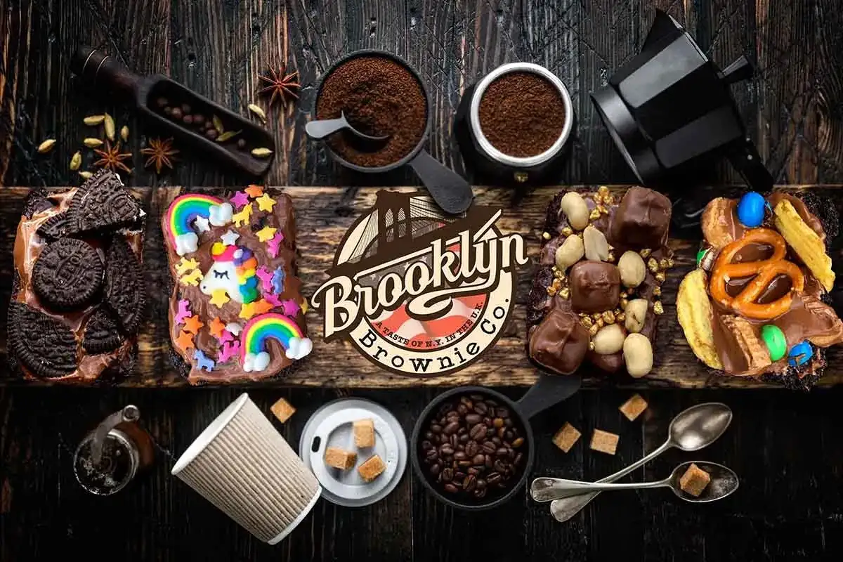
- Explain what's different: a short line on what makes you, you. Brooklyn Brownie Co leans on being handmade and American-style.
- Offer help: an easy way to ask a question before buying.
What should you avoid?
- Sliders that rotate: most people only see the first one.
- Big images that slow the page: especially on phones.
- Pop-ups straight away: let people see the shop before you ask for their email.
- Hidden delivery costs: bring them up early.
- Claims with no evidence: "the best quality" means nothing without proof.
Should a small shop's homepage look like a big brand's?
Don't copy a big brand's simple layout. Big brands can rely on being famous. A small shop has to explain itself. If nobody knows you, tell them what you sell, why you're worth trying and who else has bought from you.
How do you check whether your homepage works?
Show it on a phone to someone who doesn't know your shop, for five seconds. Ask what you sell and what they would click. Then check your analytics: how many people go from the homepage to a product?
If you would like help, see our e-commerce websites, or find out how to create an online store from scratch.
How do you apply this to your own shop’s homepage?
Start with one clear offer, your best products and the reasons to trust you, then test it on a phone.
Good ecommerce websites make the next step obvious. When we work on ecommerce website design, we check:
- Can a new visitor tell what you sell within a few seconds?
- Are delivery costs and returns easy to find?
- Do your bestsellers sit near the top?
- Does it load quickly on mobile data?
Frequently asked questions
What should be on an ecommerce homepage?
A clear statement of what you sell, a strong product image, best sellers, categories, proof and delivery information.
How long should a homepage be?
As long as it needs to be. On a phone, get the key points in early, and let people scroll for the rest.
Should I use a video?
Only if it shows the product better than a photo and doesn’t slow down the page.

Written by
Henry Ankomah
Project Director, Bluewing Digital
Henry manages Bluewing Digital projects from the first conversation through to launch and beyond, across websites, ordering systems and SEO. He writes and checks our guides too. You can book a meeting with him directly, so you always know who is looking after your project.
Last updated